
Our September 2026 roundtable examined how stock market evidence feeds into the regulatory cost of equity, asking a fundamental question:
How should the allowed return on regulated infrastructure be set, when the market evidence behind it comes from five share prices, and those prices move mostly for reasons the model cannot see?
The allowed return is the least visible number in a utility bill and one of the most consequential. It determines what investors earn for funding pipes, wires and treatment works, and therefore both what consumers pay and what gets built. To set it, regulators need a measure of risk, and the established method takes it from the stock market.
Drawing on Vallorii's Cost of Capital Lab and our VAPRI risk framework, we examined what that market evidence can carry and where it breaks down. Our approach is not to discard the current method but to build on it: start from the regulator's own number, then adjust for factors that can be evidenced one at a time, such as how long the owner actually holds the asset, how efficiently the company runs its operations, how well it delivers its capital programme, and the political risk it carries. Each adjustment is named, measured separately, and can be tested and challenged on its own terms.
What we discussed
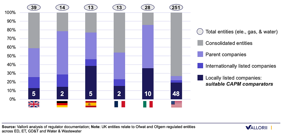
The comparator set is small. In UK electricity, gas and water there are 39 regulated entities, and five sit under a parent with a share price on a UK exchange. Every entity above that rung inherits its cost of equity from it. The pattern is not peculiar to Britain (Figure 1). Much of the room was unconvinced this is the binding constraint. If a handful of comparators move in line, investors are treating utilities as an asset class, and the method needs market movement rather than a large sample. Ofcom once set allowed returns using a single comparator. That reframes the question rather than closing it: the issue may be less how many prices there are than what those prices measure.
Figure 1. In the UK, 5 of 39 regulated infrastructure are locally listed (and used in CAPM)
Listing itself changes less than the debate assumes. Ownership model does not explain what households pay. Within UK water the listed companies did earn more: a return on regulatory equity averaging 6.7% across the last price control against minus 0.1% for the unlisted, and ahead in every year rather than on average. It did not come out of customers' pockets, since on service quality incentives the listed companies sit on the reward side. In energy networks the advantage disappears. What differs consistently is the balance sheet, where two effects pull against each other. Unlisted companies borrow more, so their equity holders commit less capital and earn a higher return on what they do commit: worth 0.74% points (Figure 2). But they pay more for that debt, which lowers annual profit and pulls the return back down by 0.40%. Start at 5.80% for a listed company and you land at 6.14% for an unlisted one. About 30 basis points.
Figure 2. Taken together, lower gearing and lower financing costs offset each other

The answer depends on choices that look purely technical. Beta is estimated, not observed. Same five companies, same index, changing only the estimation window and the frequency: beta reads 0.75 on a two-year daily window and just over 0.5 on a ten-year monthly one. Each is a window a UK regulator has used, on RIIO-3, PR24 or PR19. Statistically the estimates are indistinguishable. Financially they are 162 basis points apart, with a further 115 or so from sampling error alone.
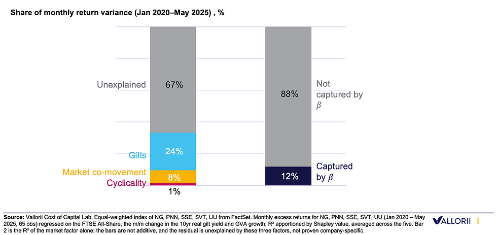
Most of what moves these prices is invisible to the model. Decomposing the monthly variance of the five share prices changes in government bond yields account for about a quarter, the stock market itself about a twelfth, and the economic cycle almost nothing. Roughly two thirds is not explained by any of the three, and beta captures about an eighth (Figure 3). Discussion turned to who is doing the buying, and to whether the growth of index funds pushes every stock's beta towards one, since index money buys the index rather than the company. Whether that effect is causal, and whether it is specific to utilities, remains open.
Figure 3. Monthly utility stock volatility is 70% driven by unexplained factors, beyond idyosincratic risk.
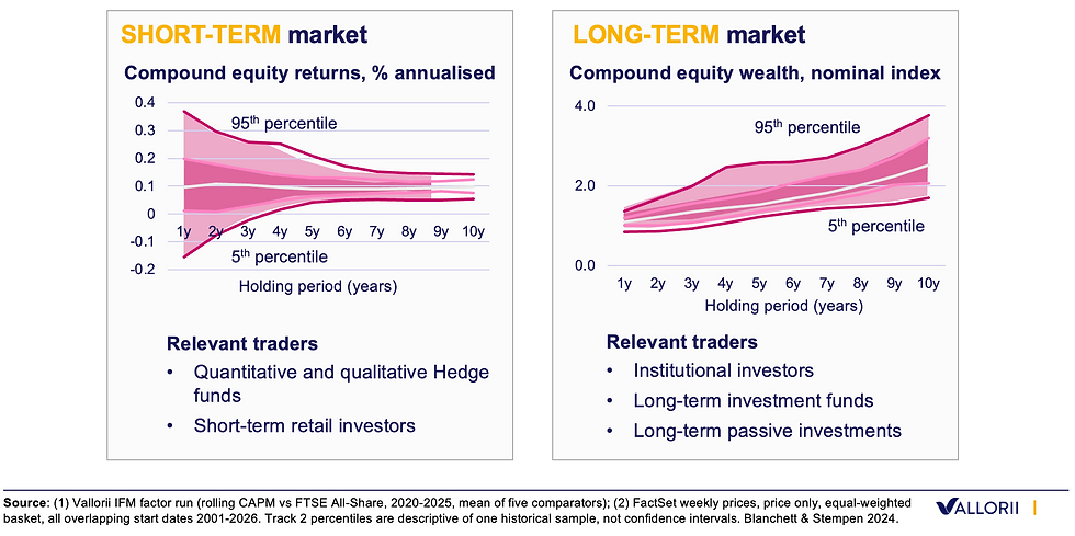
It prices the wrong time horizon. Beta measures how a share price moves with the market from one day to the next, and nothing in it asks how long an investor holds. Hold UK listed utilities for longer and the return per year evens out, while the amount an owner ends up with becomes less predictable, not more: the gap between a good decade and a bad decade is about four times wider than the gap between a good year and a bad year (Figure 4). A pension fund that will own a water network for thirty years and a trader holding for three weeks face different risks and are priced the same way.
Figure 4. Over time, compound wealth becomes more risky.
Closing
Participants debated two positions. First, whether the five comparators are workable. UK utilities move together as an asset class, so a small sample still describes it. Second, if the measure answers the wrong question. Beta describes daily price movement. A regulated network is held for decades, and the risks over that period are not the ones a share price registers from one day to the next.
Both positions accept that the estimate is imprecise. They differ on whether that is large enough to change the method. At Vallorii, we are rebuilding the evidence base around the risks an owner actually bears. And we firmly believe in the value of bringing together experts from across regulators, investors and utilities to confront these challenges.